Flexible Analytics
With the release of the new Circumstances of Admission field we are very excited to also release a completely updated Analytics section. The older analytics section was nice but frankly kind-of rigid. It didn't allow users to modify or tweak the graphs in order to see the information they wanted. In the updated Analytics section, all that changes. Our motivation for a new Analytics section was to answer the question:
"Can the analytics be flexible enough to allow users to discover answers to their own questions?"
ps: we think the answer is yes
The Five Ws
The Analytics section has been organized around the Five Ws (Who, What, Where, When and Why). Additionally, all the filters that you can apply are designed to adjust the Five Ws so that you can narrow down the data into only what you want.
Patients (Who)
The Patients sections is all about who your patients are. Such as, what are your most prevalent patients by common name, how many patients were in your care, how many species have been admitted and a whole lot more. There are pages summarizing your patients by many different taxa categories such as, common name, taxonomic class, biological group and endemic status. There are also pages summarizing your patients by many demographic and health indicators such as age, sex, attitude, body condition, dehydration and mucus membranes. The details of each category can be viewed to see their changes in over time. There is also a taxonomy tree map to visualize your patients grouped by their taxonomic ranks.

Origin (Where)
The Origin section is all about where your patients are found at. You can see the most prevalent cities and states you receive patients from and there is now a map page that plots where your patients are found at. The map will cluster patients together within a close geographic area to help you visualize groups.

Circumstances of Admission (Why)
Perhaps the most exciting section is Circumstances of Admission; ie why are your patients brought to your hospital. There is an overview of your patients most frequent circumstances of admission and all your circumstances of admission grouped by their the root circumstance. You can also see the totals of each circumstance of admission as well as the percent of each circumstance of admission compared to each other. And of course, circumstances of admission over time to illustrate their fluctuations seasonally. And, after popular request, there is now a survival rate for each circumstance of admission including their first 24 hours of care compared to after the first 24 hours.

Disposition (What)
The disposition section is about what happened to your patients at the end of their care. There's an overview page with the totals of each disposition as well as graphs illustrating when each disposition occurred. There are also specific graphs for released and transferred patients, include the type of release (or transfer) and the release (or transfer) rate of your survived patients. Of course you can see the survival rate of your patients and the percentage of each disposition. There is also a map that plots where your patients are released (or transferred) at.

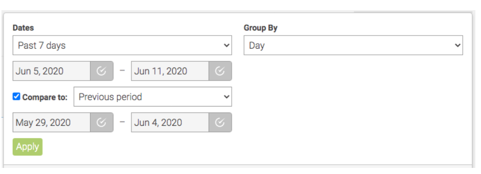
Dates (When)
We've also greatly expanded your ability to modify the date range to render the analytics within. Not only can you change the date range but you can also compare to previous date ranges and group your data by different time frequencies; ie Day, Week, Month, Quarter, Year. (Grouping dates by bigger time frequencies is perfect when looking at data over large time periods)
Segment the Data

Analytic Segments
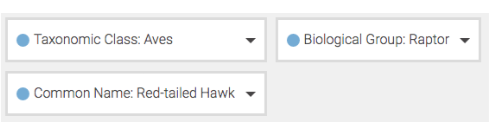
By default the graphs show data for all your patients, but what if you want to see analytics for a unique segment of your patients? For example, what if you only want to see data for your birds, or raptors, or perhaps all patients from a particular city, or even only patients that were poisoned? No problem!
Just click on the box labeled All Patients and choose which segment of your patients you wan to see.
Want to compare multiple segments of patients? Again no problem. You can choose up to three segments to create your graphs with.
Future Plans
In all honesty it is difficult to describe all the features and functionality of the new Analytics section, simply because of how much you can do with it. Even with this amazing release we are already planning improvements. Soon, we hope to allow you to save favorite graphs into one convenient place. We also want to create the ability to have even more specific segmentation; for example, render the charts for only "songbirds that also had an interaction with a cat"
We are very interested in any charts that you may generate at your own hospital. If there are any useful charts that you think we are missing PLEASE TELL US and share your charts with us (support@wildneighborsdp.org)! Additionally if you are not able to "discover answers to your own questions" PLEASE TELL US. There may be some tweaking that we need to do.
A Word of Caution
Looking at your analytics can be extremely fun and interesting, however I would like to express a word of caution. It is very easy to read to far into what the analytics are showing you. In other words, don't let the analytics let you jump to conclusions. Let the analytics confirm, deny or improve your questions. If you see anomalies in the analytics that might indicate something important, or maybe just the result of bad data that needs correcting.
Other than that enjoy the new Analytics!